Set Design: Creating Backgrounds That Build Authority
Master YouTube set design to create professional backgrounds that build authority and brand recognition. Learn visual composition, color theory, and set dressing strategies that elevate your content.
Executive Summary
Your set is the stage upon which your expertise performs - and audiences judge that performance within milliseconds of clicking your video. Set design isn’t interior decoration; it’s strategic visual communication that signals authority, establishes brand identity, and creates the psychological context for your message. This comprehensive guide reveals how to design backgrounds that enhance rather than distract from your content, building the trust and credibility essential for YouTube success.
The background behind you speaks before you do. A cluttered, chaotic space suggests disorganized thinking. A sterile, empty void signals lack of substance. A thoughtfully designed set communicates professionalism, preparation, and attention to detail that transfers to perceptions of your expertise. Whether you’re working with a dedicated studio or a corner of your home, strategic set design transforms any space into a compelling visual environment.
First Principles: Visual Psychology and Set Design
Sets communicate subliminally through spatial relationships, color psychology, and compositional choices. Understanding these principles enables intentional design decisions rather than arbitrary decoration.
Spatial Perception and Authority
Depth perception influences psychological response. Shallow sets (you positioned against a wall) feel claustrophobic and amateur. Deep sets with visible background layers suggest space, success, and professional resources. Even in small rooms, creating the illusion of depth through lighting and set dressing elevates perceived authority.
The “power position” in visual composition places subjects slightly above frame center with space to “look into.” When seated, position the camera at or slightly below eye level - looking up at a subject creates psychological dominance. This subtle angle difference separates amateur webcam footage from professional interview framing.
Personal space boundaries matter. Standing too close to the background creates uncomfortable intimacy and reveals every imperfection. Distance from background (minimum 4-6 feet) provides separation, allows background blur from shallow depth of field, and prevents shadows from falling directly behind you. This breathing room signals confidence and control.
Color Psychology and Brand Alignment
Colors trigger emotional and psychological responses that persist across cultures:
- Blue: Trust, stability, intelligence, calm (ideal for educational and business content)
- Green: Growth, health, prosperity, balance (perfect for wellness, finance, sustainability)
- Red: Energy, urgency, passion, excitement (use sparingly - overwhelms quickly)
- Yellow: Optimism, creativity, warmth (friendly and approachable)
- Neutral tones (gray, beige, white): Professionalism, sophistication, flexibility
Your set’s dominant color palette should align with your brand identity and content niche. Financial advice channels benefit from blue and green suggesting trust and growth. Gaming channels can embrace energetic reds and purples. Educational content often succeeds with clean whites and blues signaling clarity and authority.
The Rule of Thirds in Set Design
Apply photographic composition principles to your set. Position yourself according to the rule of thirds - off-center, at intersection points rather than frame center. This creates visual interest and allows the background to contribute to the composition rather than serving as mere backdrop.
Leave “looking room” - empty space in the direction you’re facing. If looking slightly left of camera, position yourself in the right third of frame with empty space to your left. This feels natural; violating it creates subconscious discomfort that distracts from your message.
Balance the frame’s visual weight. If you occupy the right third, place an interesting visual element (plant, bookshelf, artwork) in the left third to create compositional balance. Asymmetry feels dynamic and professional; random placement feels chaotic.
Set Design Fundamentals
These core principles apply whether you’re designing a professional studio or optimizing a home office corner.
The Three-Zone Background System
Effective sets create visual depth through three distinct zones:
Immediate Zone (0-3 feet behind you): Keep this area completely clear. Any objects here appear in sharp focus, compete for attention, and create visual clutter. This zone is for separation only - use it to create depth and blur, not decoration.
Midground Zone (3-8 feet behind you): This is your primary set dressing area. Include 2-4 carefully selected elements that communicate your brand and expertise. These objects appear slightly soft (depending on aperture) but recognizable. Each item should earn its place through relevance and visual interest.
Background Zone (8+ feet behind you): The furthest visible layer adds depth and context. This might be a wall treatment, window view, or distant room elements. Keep this zone simple - complex patterns or bright colors here distract from you as the subject.
Managing Visual Complexity
Backgrounds should be interesting without being distracting. The key is controlled complexity - enough visual texture to prevent sterility, not so much that it overwhelms your presence.
Bookshelves: Classic authority signifiers, but require curation. Organized books suggest expertise; messy piles suggest chaos. Color-coordinate spines for visual harmony, or alternate vertical and horizontal stacks for interest. Include decorative objects (globes, plants, awards) that break up book monotony.
Plants: Living elements add warmth, color, and organic texture. Choose low-maintenance varieties that thrive in your lighting conditions (snake plants, pothos, ZZ plants tolerate various light). Position them in midground zones for visual interest without competition.
Artwork and Decor: Select pieces that reinforce your brand identity without overwhelming. Abstract art provides color and interest without demanding interpretation. Framed quotes or graphics can reinforce your message. Avoid family photos (too personal), overtly political content (divisive), or trend-heavy pieces that date quickly.
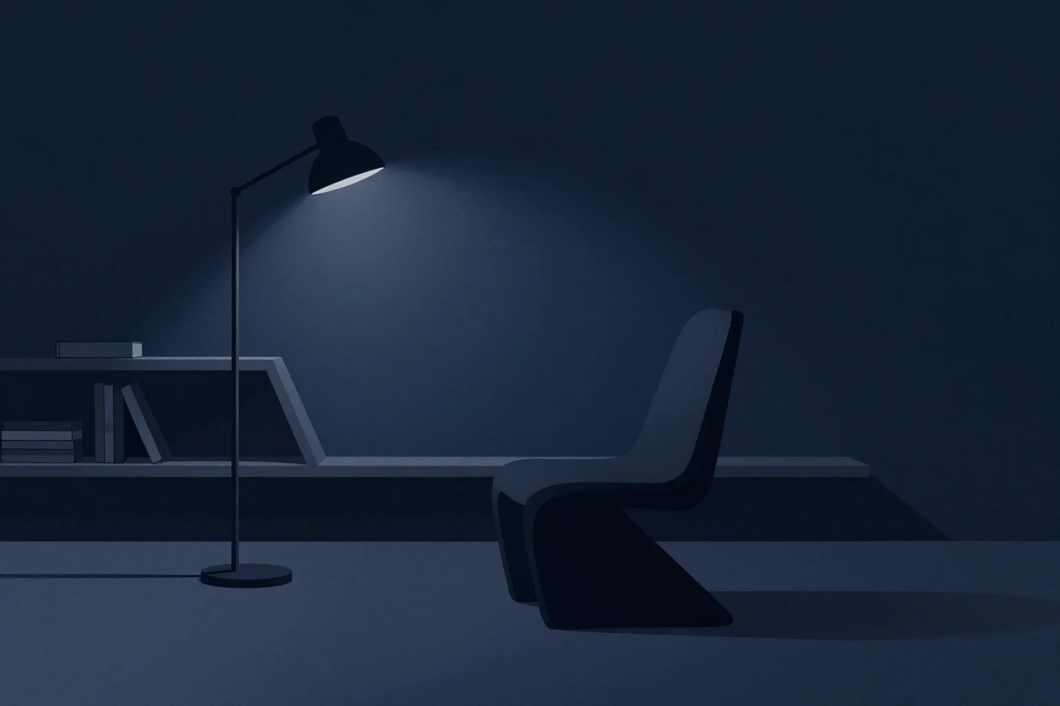
Lighting Your Set
Set lighting extends beyond three-point lighting on your subject - it includes deliberate illumination of background elements:
- Background lights: Separate background zone from darkness; add dimension
- Practical lights: Visible lamps or light sources that provide “motivated” illumination
- Accent lights: Focused illumination on key set pieces (artwork, plants, signage)
- Color temperature consistency: Match background lighting to your key light (5600K daylight standard)
Practical lights in your set serve dual purposes: they explain where light is coming from (motivated lighting), and they provide visual interest as set elements. A visible desk lamp, shelf lighting, or neon sign adds production value while justifying illumination patterns.
Set Design by Content Type
Different YouTube content types require different set approaches. Design for your primary format while maintaining flexibility for variety.
Educational and Tutorial Sets
Authority and clarity drive educational set design:
- Color palette: Blues, greens, neutrals suggesting trust and intelligence
- Background elements: Bookshelves, diplomas/certifications (subtle), relevant tools or equipment
- Work surfaces: Visible desk space for demonstrations, organized supplies
- Lighting: Bright, even illumination suggesting transparency and openness
- Avoid: Overly casual elements (beds, gaming posters), cluttered chaos
The goal is appearing as a knowledgeable professional in a real workspace - not a sterile classroom, not a chaotic bedroom. Include subtle evidence of expertise (professional books, industry tools) without creating museum displays.
Entertainment and Personality-Driven Sets
Authenticity and character drive personality channel set design:
- Personal elements: Genuine interests and hobbies visible (guitar, collectibles, creative tools)
- Colorful accents: Brighter palettes reflecting energetic personalities
- Layered environments: Multiple zones you can move between for visual variety
- Lighting flexibility: Ability to create moods from bright and energetic to dramatic and intimate
- Avoid: Generic, soulless backgrounds that could belong to anyone
Personality channels succeed when audiences feel they’re visiting your space, not a rented studio. Include authentic personal items that spark conversation and connection. The set should feel lived-in and genuine.
Product Review and Unboxing Sets
Product visibility and demonstration space drive review set design:
- Neutral backgrounds: White, gray, or beige that won’t color-cast products
- Demonstration surfaces: Clear desk space for unboxing, handling, displaying products
- Multiple camera angles: Setup accommodating wide shots and detailed close-ups
- Consistent lighting: Color-accurate, even illumination for true product representation
- Avoid: Cluttered backgrounds that distract from products being featured
Review sets must serve the product first while maintaining your brand presence. The background should frame and complement products without competing. Many successful reviewers use simple, clean backgrounds with subtle personal branding elements.
Gaming and Tech Sets
Tech credibility and cultural relevance drive gaming set design:
- RGB elements: Controlled, tasteful lighting accents reflecting tech culture
- Equipment visibility: Quality peripherals, multiple monitors, organized cable management
- Thematic decor: Posters, figurines, or collectibles reflecting your gaming focus
- Multi-functional spaces: Setup accommodating both gameplay capture and talking-head segments
- Avoid: Excessive clutter, dust, or cable chaos that suggests disorganization
Gaming sets must balance credibility (showing you have serious equipment) with professionalism (showing you’re not living in a teenager’s bedroom). Organized, well-lit tech spaces signal expertise and dedication.
DIY Set Design on Any Budget
Professional-looking sets don’t require professional budgets. These strategies maximize visual impact through creativity rather than expense.
The $0 Set Redesign
Transform your existing space without spending money:
- Reposition: Move away from walls to create depth (even 3 feet helps)
- Declutter: Remove everything that doesn’t serve your brand or add visual interest
- Rearrange: Reposition furniture to create better compositional balance
- Repurpose: Use existing items (books, plants, awards) as set dressing
- Reorganize: Tidy and style existing bookshelves with intentional arrangement
Start with a completely empty background zone. Add elements one at a time, evaluating each addition’s contribution. Often, removing items improves sets more than adding them.
Budget-Friendly Upgrades ($50-200)
Small investments yield dramatic visual improvements:
- Backdrop systems: Collapsible fabric backdrops ($30-80) provide instant controlled backgrounds
- LED strip lights: RGB or white LED strips ($15-40) add dimension and accent lighting
- Plants: 2-3 low-maintenance houseplants ($20-60 total) add life and color
- Art prints: Quality art prints or posters in simple frames ($30-100) add personality
- Books: Thrift store hardcovers in coordinating colors ($20-40) fill shelves with authority signals
Focus investments on elements visible in your primary camera angle. A $50 backdrop system provides more visual impact than $500 in lighting if your current background is a messy room.
Professional Studio Elements ($500+)
As channels grow, strategic investments elevate production value:
- Custom backdrops: Printed fabric backdrops with subtle branding or texture
- Built-in shelving: Custom millwork designed specifically for your space and brand
- Accent lighting: Professional RGB fixtures, practical lamps, or LED panels for background illumination
- Set pieces: Quality furniture (desk, chair, shelves) that reflects brand positioning
- Branded elements: Neon signs, custom artwork, or logo displays integrated into the set
Professional elements should compound over time rather than requiring massive upfront investment. Add one quality element quarterly, building a sophisticated set gradually while maintaining consistent output.
Common Set Design Mistakes
Avoid these pitfalls that sabotage even expensive equipment investments.
The Green Screen Trap
Virtual backgrounds promise professional polish without physical set design. Reality rarely delivers:
- Lighting requirements: Green screens demand perfect, even illumination - more challenging than most creators achieve
- Edge artifacts: Poor keying creates jagged edges, green spill, or transparency issues
- Interaction limitations: You can’t physically interact with virtual elements
- Authenticity costs: Virtual sets signal low effort and undermine authority
Unless you have professional lighting, a quality green screen, and sophisticated keying skills, physical sets almost always outperform virtual backgrounds. Invest in real set design before considering virtual solutions.
Background Distractions
Common distracting elements that destroy set effectiveness:
- Mirrors and glass: Reflect lights, reveal crew/camera, create confusing visual layers
- Busy patterns: Stripes, busy florals, or high-contrast designs that compete with you
- Moving elements: Ceiling fans, flickering lights, or anything that draws eye movement
- Personal clutter: Messy desks, piles of papers, tangled cables
- Competing focal points: Bright windows, televisions, or other light sources behind you
Audit your set through your camera before every recording. Sit in frame and identify anything that draws your eye away from where your face will be. Remove or reposition those elements.
Inconsistency and Chaos
Jumping between dramatically different sets without explanation confuses audiences and undermines brand recognition. While variety prevents monotony, maintain core visual consistency:
- Color palette consistency: Use the same dominant colors across different locations
- Branding elements: Include consistent logos, color accents, or signature items
- Lighting style: Maintain similar lighting quality and direction even in different spaces
- Dress code consistency: Your appearance should match set formality (suit in messy room looks wrong)
If you film in multiple locations (home office, co-working space, outdoors), include transitional explanations or consistent intro/outro graphics that bridge the visual differences.
The AutonoLab Advantage
Set design balances aesthetic principles with brand strategy and practical constraints - a complex optimization that many creators struggle to navigate. AutonoLab’s intelligent visual analysis platform evaluates your current set design through the lens of authority-building and audience engagement, identifying specific elements that enhance or undermine your credibility.
The platform analyzes successful creators in your niche to identify set design patterns that correlate with high engagement and subscriber growth. Rather than generic advice, you receive recommendations tailored to your content type - educational channels benefit from different approaches than entertainment or review channels. AutonoLab helps you understand whether your set is communicating expertise, approachability, or confusion.
For creators managing multiple set configurations or filming locations, AutonoLab provides consistency analysis, ensuring visual branding remains cohesive across different environments. The platform also assists with practical implementation - suggesting specific products, arrangements, and lighting configurations that achieve professional results within your budget and space constraints.
Implementation Checklist
Set Analysis and Planning:
- Photograph current set and identify distracting elements
- Define brand personality and appropriate color palette
- Measure available space and identify three-zone possibilities
- Audit existing items for potential set dressing use
- Sketch desired set layout with zone designations
- Plan lighting for subject and background elements
Set Construction:
- Create minimum 4-6 feet distance from background
- Clear immediate zone (0-3 feet) completely
- Select and arrange 2-4 elements for midground zone
- Apply rule of thirds positioning for compositional balance
- Add background lighting or practical lights for dimension
- Test camera angle, focus, and depth of field effectiveness
Ongoing Maintenance:
- Regular decluttering between filming sessions
- Plant care and replacement as needed
- Lighting consistency checks and color temperature verification
- Seasonal updates to maintain visual freshness
- Documentation of successful setups for consistency
- Periodic audience feedback collection on set design
Conclusion
Set design is visual branding in physical form - the environment that frames your expertise and establishes authority before you speak a word. Whether you’re working with a dedicated studio or a carefully optimized corner of your home, strategic set design transforms any space into a compelling stage that supports your message and builds audience trust.
Master the fundamentals: create depth through three-zone design, control visual complexity through curation, align colors with brand psychology, and apply compositional principles that guide viewer attention. Design specifically for your content type while maintaining consistency that builds recognition across your catalog.
Avoid common traps: resist the temptation of virtual backgrounds without professional keying capabilities, eliminate distracting elements that compete for attention, and maintain visual consistency that reinforces your brand identity. These mistakes cost you credibility regardless of how expensive your camera equipment may be.
Remember that your set is a tool serving your content, not an end in itself. The best backgrounds enhance your presence without demanding attention. They communicate authority, authenticity, and attention to detail - qualities that transfer to perceptions of your expertise and keep audiences watching, trusting, and returning for more.