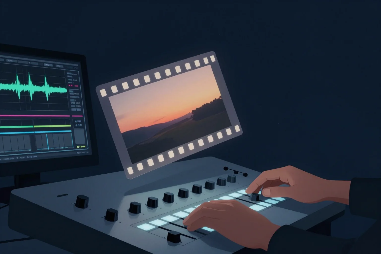
Color Grading: Making Your Videos Look Cinematic
Transform ordinary footage into cinematic masterpieces with professional color grading techniques. Learn LUTs, scopes, and workflows for stunning visual results.
Color Grading: Making Your Videos Look Cinematic
Executive Summary
Color grading transforms ordinary footage into visually stunning content that captures attention and conveys emotion. While capturing quality footage matters, post-production color work separates amateur productions from professional cinematic experiences. This comprehensive guide explores color theory fundamentals, demystifies technical tools like scopes and LUTs, and provides systematic workflows for achieving consistent, beautiful results across all your content. Whether you’re grading footage from a cinema camera or a smartphone, mastering these principles elevates your visual storytelling and creates the polished aesthetic that modern audiences expect from premium content.
First Principles: Why Color Matters
Color profoundly affects human psychology and perception. Before viewers process content intellectually, they experience it emotionally through color associations. Warm tones feel inviting and energetic; cool tones suggest calm or melancholy; high contrast creates drama; low contrast feels dreamy or nostalgic. Understanding these responses lets you intentionally design emotional experiences.
Technical color work serves two masters: correction and grading. Correction fixes problems - imbalanced white points, inconsistent exposures, mismatched cameras. Grading makes creative choices - stylistic looks, mood enhancement, visual storytelling. Both are essential for professional results.
Color consistency creates brand identity. When viewers recognize your visual style across different videos, you’ve achieved something valuable: distinctive aesthetic DNA that separates your content from competitors. This recognition builds familiarity and trust over time.
Color Theory for Video Creators
Understanding color theory fundamentals helps you make informed creative decisions. These principles aren’t abstract art concepts - they’re practical tools for achieving specific visual results.
Color temperature describes warmth (orange/red) versus coolness (blue). Measured in Kelvin, natural light ranges from warm sunrise (~2000K) to cool daylight (~5500K) to warm sunset (~3000K). Your white balance settings determine how cameras interpret these temperatures, but post-production can adjust them further.
Hue is the pure color itself (red, blue, green). Saturation measures color intensity - high saturation appears vivid and bold; low saturation approaches grayscale. Luminance describes brightness, from pure black to pure white. Professional grading manipulates all three independently.
Color harmony creates pleasing combinations. Complementary colors (opposite on the color wheel) create vibrant contrast. Analogous colors (adjacent on the wheel) create subtle, cohesive looks. Triadic combinations (evenly spaced on the wheel) offer balanced variety.
Contrast determines visual impact. High contrast (bright highlights, deep shadows) feels dramatic and energetic. Low contrast (compressed range, lifted blacks) feels softer and more atmospheric. Your contrast choices dramatically affect emotional response.
The Technical Toolkit: Scopes and Monitors
Professional color work requires objective measurement tools. Human eyes are unreliable judges - they adapt to surrounding colors and fatigue over time. Scopes provide scientific accuracy that ensures consistent results.
Waveform monitors display luminance (brightness) across your image from left to right. They show whether your image is properly exposed, where highlights might clip, and whether shadows crush to pure black. Learning to read waveforms takes practice but provides invaluable exposure guidance.
Vectorscopes display color information, mapping hue and saturation on a circular graph. Skin tones should fall along the skin tone line (roughly between red and yellow). Colors extending toward the edges indicate high saturation; colors near the center indicate low saturation.
Histograms show the distribution of brightness values across your image. A balanced histogram spans the full range without bunching at either extreme. However, creative grading often intentionally creates imbalanced histograms for stylistic effect.
False color overlays color-coded brightness information directly on your image. Different colors represent specific brightness values, making it easy to identify exposure problems at a glance. This is especially useful for achieving consistent skin tones.
The Color Grading Workflow
Systematic workflow prevents overwhelm and ensures nothing gets overlooked. Professional colorists follow structured processes that you can adapt for any project.
Step 1: Primary Correction Start by fixing major technical issues. Balance exposure using lift (shadows), gamma (midtones), and gain (highlights). Correct white balance using temperature and tint controls. These foundational adjustments should make footage look “normal” before creative work begins.
Step 2: Shot Matching Ensure visual consistency across different shots, especially when using multiple cameras or lighting conditions. Match exposure, color temperature, and contrast so cuts feel seamless. This step often requires comparing shots side-by-side and making careful adjustments.
Step 3: Secondary Correction Address specific problem areas. Use power windows or HSL (hue, saturation, luminance) qualifiers to isolate and adjust specific colors or regions. Maybe the sky needs different treatment than skin tones, or product colors require accuracy. Secondary tools provide surgical precision.
Step 4: Creative Grading Apply stylistic choices that serve your narrative and emotional goals. This is where you create “the look” - warm and inviting, cool and mysterious, vibrant and energetic, or muted and contemplative. Creative grading transforms technically correct footage into emotionally resonant content.
Step 5: Final Polish Add finishing touches that perfect the image. Film grain, subtle vignettes, or final contrast adjustments complete the cinematic package. These final 5% of work often provide 50% of the perceived professional polish.
LUTs: Understanding Lookup Tables
LUTs (Lookup Tables) are mathematical formulas that transform input colors to output colors. They’ve become essential tools in modern color workflows, but understanding their proper use prevents common mistakes.
Technical LUTs serve specific conversion purposes. Camera manufacturer LUTs convert log footage to Rec.709 (standard video color space). Display calibration LUTs ensure monitors show accurate colors. These technical tools solve specific problems.
Creative LUTs provide stylistic starting points. Created by colorists or sold in packs, these LUTs apply predetermined looks - Teal and Orange, Blockbuster, Vintage Film, etc. They’re powerful tools when used appropriately but dangerous crutches when relied upon blindly.
The right way to use LUTs: Apply technical LUTs first (log conversion), perform primary corrections, then layer creative LUTs at reduced intensity (often 30-70%). This approach uses LUTs as foundations you build upon rather than final solutions.
LUT limitations: No single LUT works perfectly for every shot. Lighting conditions, camera settings, and subject matter all affect how LUTs behave. Always expect to adjust after applying LUTs - treat them as starting points, not endpoints.
Creating Your Signature Look
Developing a consistent, recognizable color style builds brand identity and elevates production value. This process requires experimentation and refinement over multiple projects.
Start by analyzing content you admire. What color characteristics appeal to you? Warm or cool? High or low contrast? Saturated or desaturated? Collecting reference images helps articulate your aesthetic preferences.
Test different approaches on sample footage. Try various LUTs, adjustment combinations, and creative techniques. Document settings that achieve results you like - you’ll want to recreate these looks consistently.
Refine through iteration. Your first attempts at signature looks won’t be final. As you gain experience and your tastes evolve, update your approach. The best colorists constantly refine their techniques.
Consider your content’s emotional needs. Entertainment content might benefit from vibrant, high-energy looks. Educational content often works better with clean, accurate colors that don’t distract. Match your aesthetic to your goals.
Platform-Specific Considerations
Different viewing platforms affect how audiences experience your color work. Understanding these variables helps you make informed decisions.
YouTube and streaming platforms compress video aggressively, affecting color fidelity. Avoid extreme grading that pushes colors to the edge of legal broadcast ranges - compression artifacts often appear first in these areas. Slightly conservative grading survives compression better.
Social media platforms (Instagram, TikTok, Twitter) apply their own processing and display on various devices with different screen calibrations. Test your graded footage on multiple devices to ensure it works across the spectrum.
Mobile viewing now dominates content consumption. Grade with mobile screens in mind - subtle shadow details often disappear on phones, and extreme color shifts that look artistic on monitors might look wrong on smaller screens.
Different screens show colors differently. What looks perfect on your editing monitor might look different on a phone, tablet, or different computer. Grade on a calibrated monitor, but always check final results on multiple devices.
Common Color Grading Mistakes
Even experienced creators make color errors. Recognizing these pitfalls helps you avoid them in your own work.
Over-saturation screams amateur. While vibrant colors catch attention initially, excessive saturation quickly becomes fatiguing and feels unprofessional. Start with subtle adjustments and increase only if the content genuinely needs more intensity.
Extreme contrast destroys detail. Crushing blacks to pure black and clipping highlights to pure white eliminates information that might be important. Preserve detail in shadows and highlights unless destroying it serves creative purposes.
Inconsistent white balance across shots in the same scene creates jarring jumps. Always match color temperature between shots, especially when using multiple cameras or shooting at different times of day.
Ignoring skin tones produces unsettling results. Human viewers are hyper-attuned to skin color accuracy. If skin looks too orange, too red, or too green, viewers notice immediately and find it distracting. Always prioritize skin tone accuracy.
Blind LUT application without adjustment creates generic looks. Every shot needs customization after LUT application. The photographer who applies the same Instagram filter to every photo achieves similar monotony - avoid this trap.
Grading in uncalibrated environments produces inconsistent results. If your editing monitor shows colors inaccurately, you’re grading blindly. At minimum, ensure your workspace has consistent lighting and your monitor isn’t set to extreme brightness or contrast.
Advanced Color Techniques
Once you’ve mastered fundamentals, explore sophisticated techniques that separate professional colorists from competent editors.
Power windows isolate specific image regions for targeted adjustments. You might darken edges (vignette) to focus attention on the center, or isolate a window to adjust only sky color. These masks follow subjects when combined with tracking.
Qualifier selections use HSL ranges to isolate specific colors for adjustment. You can target only reds, or only highly saturated blues, or only skin tones. This precision allows surgical corrections without affecting the rest of the image.
Parallel node structures in advanced software like DaVinci Resolve let you apply multiple adjustments simultaneously without them interfering. One node corrects exposure, another adjusts color balance, a third applies film grain - organized separately but combined in output.
Temporal adjustments analyze changes over time. When subjects move through changing lighting, temporal noise reduction or automatic exposure compensation can smooth inconsistencies that would otherwise require frame-by-frame correction.
HDR grading for high dynamic range displays opens new creative possibilities. With wider brightness and color ranges, HDR allows more dramatic highlights and deeper blacks while preserving detail throughout. However, HDR requires specialized monitoring and workflow considerations.
The Color Grading Checklist
Use this comprehensive checklist for every project:
Pre-Production:
- Establish target color aesthetic and reference images
- Ensure consistent lighting during filming
- Shoot color charts or gray cards for reference — [ ] Set camera color profiles appropriately (log vs. standard)
Setup:
- Calibrate editing monitor or work in controlled lighting
- Set up scopes (waveform, vectorscope, histogram)
- Organize footage by scene or lighting condition
- Prepare LUTs and color palettes for the project
Primary Correction:
- Balance exposure (lift, gamma, gain) for each shot
- Correct white balance (temperature and tint)
- Match shots within scenes for consistency
- Verify skin tones fall on vectorscope skin tone line
Secondary Correction:
- Isolate and adjust specific colors using qualifiers
- Apply power windows for regional adjustments
- Address any remaining technical issues
- Ensure highlight and shadow detail preservation
Creative Grading:
- Apply stylistic LUTs at appropriate intensity (30-70%)
- Adjust hue, saturation, luminance for desired mood
- Modify contrast to match emotional goals
- Create visual consistency across the project
Final Polish:
- Add subtle film grain or texture if desired
- Apply gentle vignette to focus attention
- Verify color consistency from beginning to end
- Export and test on multiple devices/screen types
Measuring Color Success
Color effectiveness reveals itself through multiple metrics, both technical and subjective.
Retention graphs show whether your visual style maintains engagement. Videos with thoughtful color grading typically show more consistent retention - viewers aren’t distracted by technical problems or bored by flat imagery.
Comment analysis reveals subjective impact. Viewers mentioning your “beautiful visuals,” “cinematic look,” or “great colors” indicate that your grading achieved noticeable impact. These qualitative signals complement quantitative data.
Brand recognition measures long-term success. When audiences can identify your content from thumbnails based on visual style alone, you’ve achieved distinctive color branding. This recognition takes time but represents significant competitive advantage.
A/B testing different color approaches validates assumptions. Test versions with different grading styles and compare performance. Data-driven refinement optimizes your color strategy based on actual audience response rather than personal preference.
Tools for Color Grading Excellence
Multiple software options provide professional color capabilities. Understanding these tools helps you choose based on your needs and budget.
DaVinci Resolve offers industry-standard color tools for free (paid Studio version adds advanced features). Its node-based workflow, advanced scopes, and professional grading capabilities make it the choice of Hollywood colorists. The learning curve is steep but the capabilities are unmatched.
Adobe Premiere Pro and After Effects provide capable color tools within familiar editing environments. Lumetri Color offers scopes, LUT support, and primary/secondary corrections. While not as comprehensive as Resolve, these tools suffice for most creator needs.
Final Cut Pro includes professional color tools with the advantage of Mac optimization. Its color board and advanced grading features handle most projects effectively, especially for creators invested in the Apple ecosystem.
Third-party plugins extend capabilities. Color Finale, FilmConvert, and similar plugins add specialized tools to your existing software. These are especially valuable for specific looks (film emulation, vintage styles) or workflow efficiency.
AutonoLab provides intelligent color suggestions based on content analysis. The platform recommends LUTs, exposure adjustments, and stylistic choices that match your footage characteristics and content goals. This AI-assisted approach helps beginners achieve professional results faster.
Conclusion: The Art of Visual Refinement
Color grading transforms captured footage into finished art. It requires technical knowledge, creative vision, and systematic workflow. The investment in learning these skills pays dividends through content that looks professional, feels intentional, and resonates emotionally with viewers.
Your color journey is ongoing. Each project offers opportunities to refine techniques, develop your aesthetic, and create increasingly sophisticated looks. The goal isn’t achieving a single “perfect” grade - it’s developing the judgment to choose appropriate colors for each story you tell.
Start grading your next project with intention. Use the principles and workflows in this guide to elevate your visuals from acceptable to exceptional. Your audience notices the difference, even when they can’t articulate why. That feeling - the sense that your content looks cinematic, professional, and distinctive - is the colorist’s ultimate achievement.
The palette is yours. Paint something beautiful.